Original Design Considerations
[inlinetweet prefix=”” tweeter=”” suffix=””]Design is a tricky process. Forge your own path, and you risk looking foolish. Match current design trends and you could end up being forgettable.[/inlinetweet] At Credo Courses we’re aiming for a simple and clean design. This means the use of neutral colors and plenty of white space to let the content breath. Simple designs age well. When strictly followed, simplicity also ensures a pleasant user experience.
On the order klonopin easy buy online homepage we feature large icons of our scholars and courses. Because these icons are so prominent in the design, we knew we had to get them just right. Our initial design was intended to mimic the periodic table of elements. There were several critical design considerations:
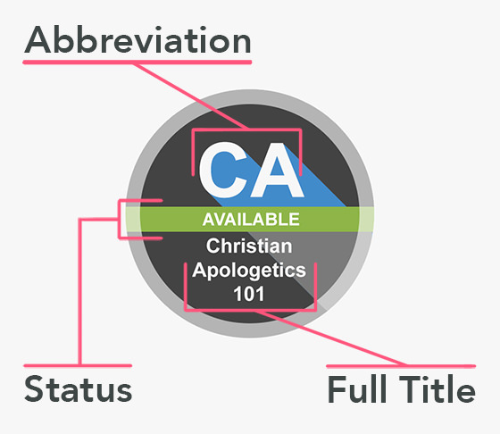
- Informative: The design needed to be capable of presenting all relevant information. For scholars this included their name and current position. For courses this included an abbreviation of the course name, an indication of its availability, and the full name of the course.
- Readable: A pretty design isn’t much good if it’s unreadable. Contrast, simplicity, and legible font sizes are essential to readability. Integrating text into an image is always a risk. Although text may be readable on a large laptop screen, it may be unreadable on a smartphone.
- Consistent: Remember how bad websites used to look? Here’s an example of horrible website design. [inlinetweet prefix=”” tweeter=”” suffix=””]Inconsistency is one of the hallmarks of bad design.[/inlinetweet] Our icons needed to work with the design of the website, product images, social media graphics, etc. to provide a consistent and enjoyable user experience.
- File Size: Not everyone has access to high-speed internet. In particular, browsing the web on a mobile device can be agonizingly slow. We wanted mobile users to have the best experience possible. Therefore, small file sizes were a must.

Customer Suggestions
After the initial design process was complete we really wanted to get feedback from our customers. After all, it’s the customers who will be using the website. Luckily, we had a small, but highly dedicated group of early adopters and customers. They rose to the occasion and gave us some great feedback. We emailed close to 100 people and we were thrilled to receive over 25 emails in response.
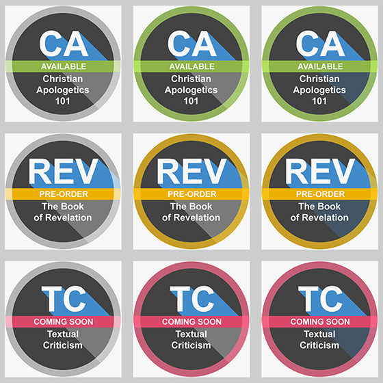
- Column One: This is the original design. Its color scheme is simple and neutral. The ribbon across the middle indicates the availability of the particular course.
- Column Two (Customer Suggestion #1): The idea of matching the color of the collar to the ribbon can be attributed to Jeremy. It made sense to us so we decided to give it a try.
- Column Three (Customer Suggestion #2): Both David and Jeremy suggested that the full title of the course needed to stand out more. Taking their suggestion to heart, we darkened the background to increase the contrast. You’ll notice that this column also includes the colored collar.

Learning from Our Customers
The rules of customer service are simple:
Rule #1: The customer is always right.
Rule #2: If the customer is wrong, please see rule number one.
[inlinetweet prefix=”” tweeter=”” suffix=””]Sometimes experts think that they’re an exception to the cardinal rules of customer service[/inlinetweet]. After all, they have a degree and their customers probably don’t. But remember where we started: “Design is a tricky process.” There’s no such thing as a perfect design. It doesn’t matter if your design is “textbook” if your users don’t like it? Although a good design textbook will acknowledge this, it’s easy to become enamored with your own designs.
Be Part of the Design Process
Which design do you like? What would you change? We’d be remise if we didn’t solicit your suggestions after all our pontificating! There are two primary ways you can be part of the design process for Credo Courses:
- Signup for the Credo Courses Newsletter, and you’ll get hear about upcoming projects and be able to offer your input.
- Let us know what you think in the comments section below.


